Key Character Design Discussion

This is a topic for discussing the art and design behind Key’s iconic characters.

Character design is incredibly important. A good design can communicate a character’s essential qualities and personality, without a single word.

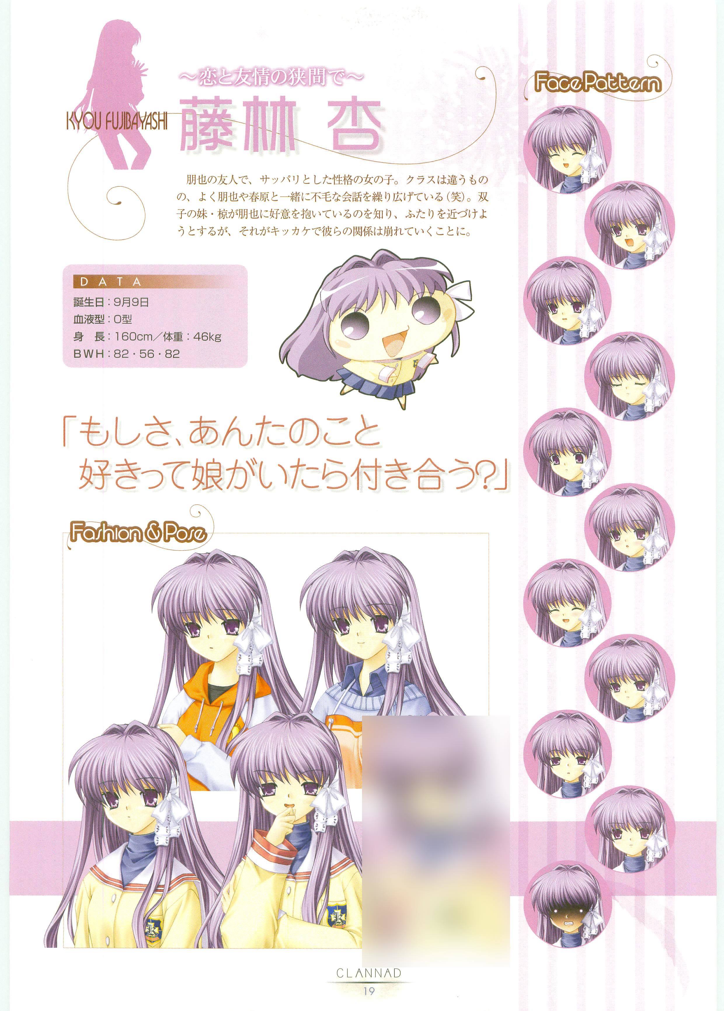
When talking about a character’s design, be sure to include an image for reference. Preferably, choose an image of the character in a neutral pose (multiple angles is a plus) drawn by the original artist. Be sure to call out the character designer (Itaru Hinoue or Na-Ga). Character studies from the Visual Fan Books and Art Books are excellent if you have access to them.

In your analysis, don’t just say that you like or dislike a given design. Call out details and what those mean for the character. What does the shape of their eyes say about their temperament? Do their common accessories have any deep significance to them? Does their design reference any particular trends or hint at certain archetypes? Does the character’s story line up with or subvert the expectations set by their design?

Be sure to mark spoilers appropriately using the [spoiler] tag.

7 Likes

The most interesting design for me is LB!'s Mio. Here’s her sprite page from the visual book. What’s Immediately striking about Mio is her almost outworldly color scheme. Her hair is a bright blue while her eyes are a dark orange. Those are far from natural colors; they’re also inverts of each other, so they stand out even more. It’s pretty weird how they gave such colors to a character that’s supposed to not have much of a presence. In the book, Na-Ga describes how he wasn’t very happy about Mio losing her glasses during development, but i really don’t mind because Mio’s eyes are amazing (Though I do want a Key meganeko someday). I’ve always felt that Mio conveys a lot more emotion through her eyes than anything else. Looking at her sprites in the book, I’ve counted 11 different eyes; they’re tiny differences but still. Someday, I’m gonna have to learn how to go through graphic files so that I can actually count all of them. Another obvious part of Mio’s design is her parasol, though I’m not quite sure what to say about it. It’s one more thing that makes her look abnormal. So I guess a theme of Mio’s design is that there is something strange about her that you don’t understand.

Relating this to the stereotype of the bookworm character, Mio is an interesting case. The expressiveness of her eyes, I would say, aligns with the bookworm, as having ways of communication other than words is up their alley (or maybe I’ve just watched KamiNomi one too many times). The parasol could be for or against the stereotype; On one hand it makes her stand out, but on the other it gives her a refined style. The colors definitely don’t go along with the stereotype though. Looking at Mio’s actual character we can see that she does break the mold quite a lot, so maybe this design does have a lot of thought behind it. Sadly Na-ga doesn’t really go into detail about it in the book.

6 Likes

Great topic.

I’m a little bit worried about Akane’s look in the forthcoming Rewrite anime. Looks too “loli” and too cute, and we know her… So it seems out of character in my opinion.
I prefer the way she was presented in the Visual Novel by far.

It’s not that it looks “ugly” at all, it’s just a matter of personality. Those who know the VN will understand.

[quote=“zetaFairlight, post:3, topic:2449”]
Those who know the VN will understand.
[/quote]No I dont understand at all. All we have is like 5 sketches that showed up in the PV for like 5 seconds. She hasnt been “presented” as anything yet. We havent even seen anything animated yet. It doesnt make any sense to me to try to make that kind of judgement at this point.

1 Like

Hi,

I don’t know, Yerian. For me those sketches are a clear guide, I believe we can have an idea of what’s different.

I think they’re showing us what to expect (at least the basic), and maybe images are reference images for their animators. Probably…

We can extrapolate a little bit, based on the information we have and (not to judge) but to talk about what we feel about what we’re watching.

Anyway, please do understand this: :slight_smile: (just in case I wasn’t clear enough)
I like the new style, it’s OK, modern.

And I’m very happy to have Rewrite animated! I have faith on the project.

And there will be differences, just like in every adaptation…
Side note: a friend of mine (a painter) also felt the same. She saw them knowing the originals and told me her opinion. And I believe some people on this forum too… Only time will tell, for all of us.

Not judging, just thinking about what we are actually seeing. And wishing that their aspect will represent their character accurately.

Am I alone on this feeling about Akane?
It looks OK, but it is more… anime-friendly perhaps?

Anyway, it’s just an opinion.

I like to discuss this with others in order to see what they see and feel. It’s like a “market research”. Because they people can see something completely different than you and me, and it may be even good for the anime (I wish the anime success).

Again, only time will tell with precision… even then, we’ll look the same thing with different eyes. That’s how it works.

P.S.: I still remember all our speculations about Charlotte, some were wrong, but a lot of them were correct. Fun and interesting days!

1 Like

I’ve always liked the compare and contrast between Kyou and Ryou’s character designs by Itaru Hinoue. They are supposed to be twins, and have something of a Yin-and-Yang quality to them.

First off, similarities. Both characters have lavender hair and sport thigh high white socks. The purple hair seems to be natural? At least, no one seems to comment on this unusual color. They both sport the same lacy white hair decoration framing their face. I’m pretty sure the thigh highs are largely there for sex appeal and to reinforce Kyou’s tsundere archetype. The hair decoration seems to just be a matter of making them distinctive, and reinforce their femininity.

Now for the differences. The first thing you’ll notice is hair length. Kyou sports very long hair while Ryou’s is short. It’s hard to say what this signifies, but to me Ryou’s short hair seems very orderly while Kyou’s long hair is more wild and untamed. I think this adds to Kyou’s tomboy image and personality. In the novel, when Kyou chops off her hair, it’s less clean cut than Ryou’s. The second key difference is the eyes. Kyou’s eyes are purple and tsurime (pointy) while Ryou’s are blue and tareme (rounded). This is a key way to show temperament: Kyou is tough and brash while Ryou is more subdued and docile. This color difference is also notable in the novels in relation to the gems they prefer, with each liking the gem that’s color lines up with their eyes.


(Click through for full size)

The hair decorations also differ a bit. Ryou wears hers tied up neatly on her right, while Kyou wears hers tied downwards on her left. The character art at the top makes this very clear, though the actual sprite art in the VN is a little less obvious about it. In terms of clothing, while both wear the same school uniforms, their casual clothes differ a lot. Kyou prefers a tomboyish hoodie, while Ryou opts for a more feminine dress.

There are also a few subtle differences. Kyou’s mouth generally opens wider than Ryou’s in the sprite art, going along with her brashness. Also, the sprite art for the characters generally face at opposite angles, with Kyou facing slightly left and Ryou facing a bit right. I think this is partly to contrast the characters, but some of this is just out of necessity…the character’s have a lot of scenes where both are on screen, and having them face opposite directions makes for more natural three-way conversations.

All-in-all, I really like the designs. The characters feel distinct, but reminiscent of each other. It’s clear that they are sisters, but they don’t feel unnecessarily identical. It’s a really good lesson in how to add personality with small details.

Bonus: They probably look unusually familiar to anyone who’s watched Lucky Star.

6 Likes

Same here. I feel that she looks different but other people say she looks exactly like her sprite in the vn. Guess that’s just a personal thing. Her ‘new’ look should work in the anime. Akane with a more cute look but the same personality is what I look forward to.

Yeah but these 5 sketches are enough for me to see a difference in her design. The other girls look totally fine so it makes me wonder why there is only a change with akane.

And if her look is the only thing that will be different.

Before venturing too far, I figured it’d be best to talk about Kotori since she’s my favorite character and all. Sprite Sheet. So for a quick run-down of her design, we have long, brown and wavy hair with two braids and flower ornaments; Her uniform is the normal kaza high one, and her everyday clothes include a checkered, red skirt and a pink hoodie.

The biggest vibe I get from Kotori’s design is that she’s meant to feel like a natural part of the environment from the start. She’s Kotarou’s childhood friend that he hangs out with all the time, so the player should get a similar vibe. My reason for thinking this is mainly her outfit. Kotori is introduced wearing her normal clothes which are far from flashy. She just wears a hoodie and a skirt that don’t look particularly delicate: casual outfit for a casual person. Her hair is kind of the same. While I adore brunettes, brown’s not a colour that really stands out that much.

So what parts of Kotori’s character shows through her design? Well, we know Kotori is a very bubbly person with a great interest in gardening, and this can be related to her design with relative ease.

Obviously we can see that Kotori has a wide arrange of happy and/or silly expressions especially the one with her sparkling eyes. Kotori’s eyes are also very big, or rather her pupils are very big which makes her eyes look bigger. If we compare Kotori’s eyes to Akane’s, the white of Akane’s eyes goes a bit above her pupils while Kotori pretty much only has white on the sides of her eyes. This makes her look cuter and kinder.

Going back to Kotori’s clothes once again, their design convey both the character traits I pointed out. Both of Kotori’s outfits have the same color palette of mainly pink with a deeper red as the sub color. Kotori is the only character whose normal clothes match the school uniform; Shizuru’s red dress is close too. Pink isn’t a color you’d use for a deadpan, serious character; that just doesn’t work. Secondly, about her gardening hobby, her clothes aren’t too delicate, so it’s fine that they get dirty while she’s working.

Finally, her hair also relates to both these traits. At least going by what @therationalpi said, the ahoge is a feature of ditzy characters. Additionally, her wavy hair is a lot more wild and unkempt than the other heroines: interestingly, in the CG when she’s sleeping under the tree, her hair is spread out on the ground in a way resembling tree roots. As a final nature connection we have her big flower-shaped hair-ornaments.

Sadly I wasn’t able to find any comments from Hinoue on Kotori’s or anyone else’s design, but I’m pretty happy with the stuff I got.

3 Likes

Very cool stuff! I really like Kotori’s design, I think it’s my favorite in Rewrite, but then again I’m a sucker for wavy hair.

One thing that strikes me about her design (and pretty much all of the girls in Rewrite for that matter) is just how much horizontal space her sprite takes up! So much hair! My theory is that it’s because Rewrite was really made for a widescreen aspect ratio, where games like Kanon, Clannad, and even Little Busters were aimed at 4:3. So the wider sprites with the fanned out hair is really just a way to fill the screen, and manage all of that negative space.

Compare Little Busters to Rewrite:

Notice how Komari’s sprite is much more horizontally compact? Her ribbons almost go straight down while Kotori’s hair fans out all around her? Also, the camera is zoomed out further in Little Busters, starting at the hips as opposed to the waist, which also helps to ensure that the character takes up the right amount of the screen. Rewrite’s sprites are so wide, in fact, that if you put more than one on screen, they overlap!

Also, this face:

It really feels so…contemporary? That way of doing a shocked expression just feels like it became popular in the last few years.

3 Likes

The width of characters is an interesting point. I went and made an album of pictures showing different sprites, actually I got very into it, so I have a shitton of these. The green lines divide the screen in thirds, and it’s very consistent that they keep within the middle third.
Looking at Kotori, I think what makes her hair feel so massive isn’t how wide her braids go but instead how her middle third is filled to the brim with a single mass of hair. If we compare Kotori to Yui, the hair goes above their shoulders for both of them, but on eye level, Yui’s hair goes along the edge of her face while Kotori’s takes up a huge area, and that’s all within the same area of the screen.

2 Likes

There’s something I quite noticed about Kagari’s design by Itaru Hinoue. (Post-Common Route spoilers?) Female characters that have a mystic aura around them would usually have long, flowing hair, but Kagari is the only heroine in Rewrite who has short hair, which is strange. But it may be more about how short hair makes a girl’s face look younger, and in this case, it keeps her appearance more in line with the Key having an innocent look in canon (just look at those round eyes and flowy dress). Not to mention her white hair is already telling enough of how mystical her existence is. I did once try sketching her with long hair, but it just didn’t feel Kagari at all.

(Terra spoilers) Though there is this one scene where hair hair is drawn longer and more tree-like, and other than it makes sense since the Song of Destruction was sung at that moment, it gives her a motherly aura that the story was going for at that moment.

Her anime design (by Masayuki Nonaka) looks so absolutely adorable, but I’m slightly worried as to how Kana Hanazawa will voice her. Nonaka’s design looks even more child-like than Hinoue’s, and with how she’s voiced in the VN, her voice might not go well with her anime looks at all.

That was my first impression as well, but the more I looked into it, the more she seems closer to her original design. Surprisingly, I’m not as worried as I should be, since one of the sketches is this:

I think her “bewitching” look is given away more by her body language and her eyes narrowing occasionally, so let’s wish that the anime portrays her body language right.

4 Likes

I love the New Ayu modern Design that Hinoue did. It showcases more of a CLANNAD-Like CG if we’re talking about the eyes, but keeps the hair’s light reflection the same.

It also gives out a glare on her skin and backpack, which makes it look beautiful, and more modern.


I’m also loving the new Kanna design that Hinoue did. Kanna is like a pre-Yuiko in my mind. It actually does showcase a lot of things like Kurugaya, such as the hair, and the ribbon ornaments.

Rei’s character design is also something that I found to be satisfying. The facial structure is more mature compared to other Hinoue characters like Kotarou and Tomoya. I also love the hair. The green-hair is perfectly fit, that the background actually seems to compliment the hair.

I also love the hair cause it reminds me of other people’s hair from Key, such as Tomoyo’s hair (CLANNAD & Tomoyo After), and Shizuru (Rewrite & Rewrite Harvest Festa). It has the overlapping bang’s on the top Right (in the perspective) of his eyes.

I’m also a sucker for Harmonia’s moe.

Last but not least, would have to be the Little Busters! CG, that is actually used for the cover of the VN if I’m not mistaken.

This has to be one of the most gorgeous CG’s ever in Key-History. The way the sunset’s light, gives out that light that feels nostalgic and feels calming. The way Rin’s hair and Komari’s ribbons are flowing. And especially the facial designs. Komari smiling, and Rin with a straight face, which is true to their personalities.

10 Likes

Ohhh yeah, that new Kanna is just absolutely gorgeous. It’s pretty nice especially since there really isn’t much representation of Kanna. If you notice, this specific piece of art shows Kanna’s much gentler side, whereas her sprites in the game seem to show her all bratty-like. I guess one explanation to that is because we only interact with her through the eyes of Ryuuya, whereas this illustration seems like it’d be how Kanna would be when absolutely nobody is around.

So it feels like were glancing more at her true nature than anything.

2 Likes

As to Kagari’s white hair, I think it’s interesting that the other heroines have natural colors like brown, blond, dirty blond, black, and red. Compare that to other games where we have bright blues (Mio, Nayuki, Kano) and lavender (Fujibayashi twins)…though you could argue that blue hair is a proxy for natural black.

1 Like

This is an amazing topic guys, hats off to you! Admittedly I never studied art theory in school so I feel like I don’t have much to offer myself, but just reading what you guys have to say is really opening my eyes. Seriously, loving this topic.

2 Likes

It’s not like I’ve studied this stuff. The most I’ve done is watch video essays on cinematography which is not as fancy as it sounds

Ah that reminds me of a questions Ive been meaning to ask.

So, Shizuru ties her hair up in twin tails. But it appears that she does so with her own hair. How can you tie your hair up with your own hair!? Is that actually possible?

While we’re on the subject, Im guessing her twin tails are part of making her look younger, which of course (Rewrite post-common) creates contrast with what we learn about her fighting ability. All the same, (Shizuru route) her young, innocent image is at the same time preserved in the themes of pacifism that are presented in her route.

1 Like

How can you tie your hair up with your own hair!? Is that actually possible?

It’s called tying a knot, but that has to be a bitch to undo at night. Admittedly, I stared at her hair for a long time before realizing that.

As for her character design, I think most of Shizuru’s design is meant to set up false expectations. She looks short and innocent but she’s actually a huge combat badass. The bandage makes it seem like she’s frail and injured but her powers allow her to shrug off pretty much any wound. Hell, you don’t even expect that behind her eye patch her eye is a different color.

One thing I like about Shizuru’s design is how her twintails allow her to take up a good amount of the frame while still seeming petite. Chihaya, Akane, and Kotori all have these near-solid masses of hair behind them, causing them to dominate the frame, but the gap between Shizuru’s tails and her body makes her seem smaller.

Here’s that overlap image again from earlier. Shizuru is only a little shorter than Chihaya, and her sprite width and shoulder width are about the same. Yet, Shizuru looks so much smaller because of all that background we see through her hair.

3 Likes

Huh, I guess youre right. Maybe its just the way her knots look so loose that was mystifying me…

There’s a technique where you where you wrap a section of hair around a hair tie to cover it, so there might be a hair tie hidden under there.

2 Likes