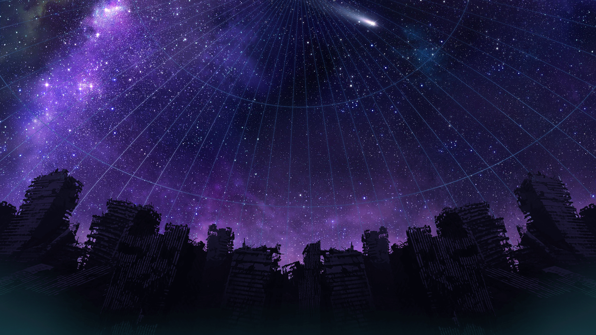
I already posted this on Twitter but here’s my contribution for LB10th, albeit a little late again.

26 Likes
As always amazing. Would you mind explaining how you painted this one? I’m quite amazed by how the silhouettes of the characters and desks are so well defined while having this kind of blurred paint.
1 Like
Very cool! I love the watercolor-esque aestheic!
1 Like
Sunsets feel too dramatic and day seems too bright so I ended up with a blue morning. It was also raining hard while I was making this so I guess that contributed a bit to the emotion. I wanted to portray endings and beginnings, farewells and a new day, but I’m honestly unsure if I translated that well here 
5 Likes

That looks great! But do you have a better scan of it? It’s hard to read the text.
1 Like
Yes, here is what the lyrics say, when I have better lighting I will make a better picture of the drawing 


2 Likes
6 Likes
Currently I am doing a Little Busters illustration every day for Inktober and as a countdown to the game! Feel free to check out~
9 Likes
Here’s a Mio fanart I spawned some few days ago :'D
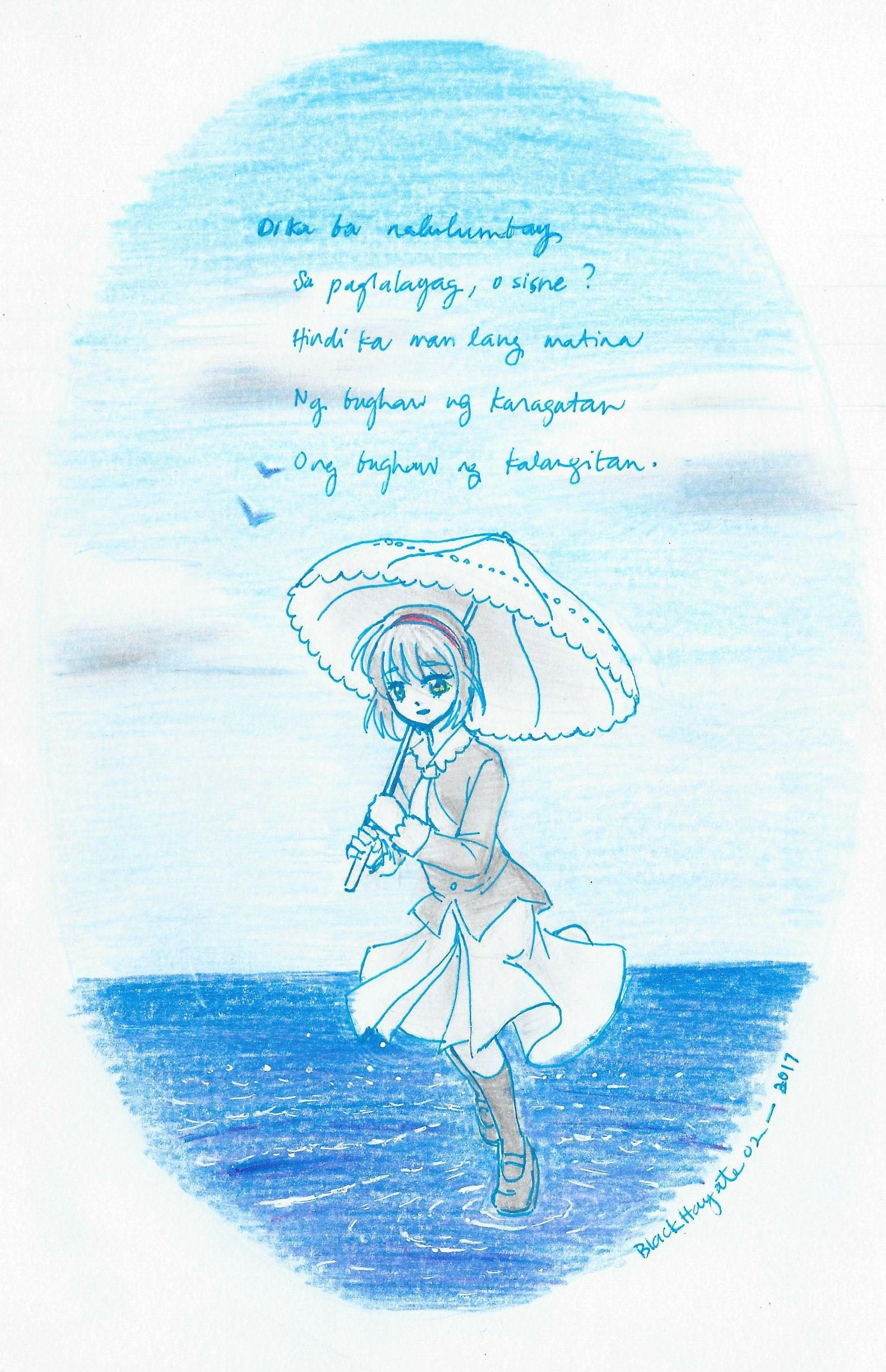
(yeah I totally messed up with the ripples here haha)
The text here obviously came from the Sad Bird poem referenced in the route. I found a really good translation of the poem, and that’s where I based the translation I did, which I put in the fanart (I can’t help it; I really like our mother tongue  ).
).
[Note: The original word for “white bird” or “seagull” in the poem is “shiratori,” and I’ve noticed that the same kanji can also be a word for “swan.” The word I used here, “sisne” refers to the latter, and it’s really just because I can’t find a word for “seagull,” plus I don’t want to go for the more literal “puting ibon.” (vague Mio spoilers) Also, sometimes I wonder if certain things in her route took from Swan Lake, to some extent.]
16 Likes
Is so beautiful,i love it!
1 Like
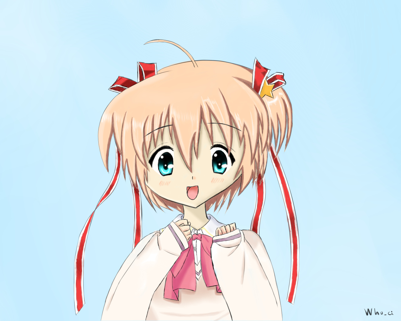
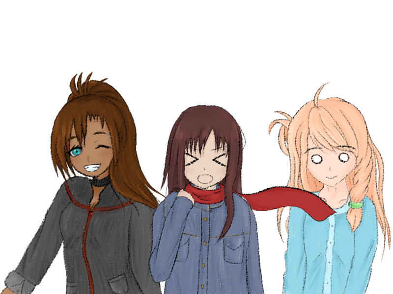
I finished my Komari drawing.
Have you got any tips for help me in drawing? i would like to know them.
Hope you like the drawing!
11 Likes
Your coloring is really good, especially on the face and on the ribbons.You don’t need to worry about color at all, I wish I did hair highlights that well.
I think if you were to practice on something, it’d be the anatomy. It’s entirely personal preference, but I for example would round out the face and make it less wide.
From the chin, start a slightly curved line, and then once you get to the bottom of the cheek, bring the line up harshly, so that it’s almost a straight upward line (around 20 degrees off straight.)
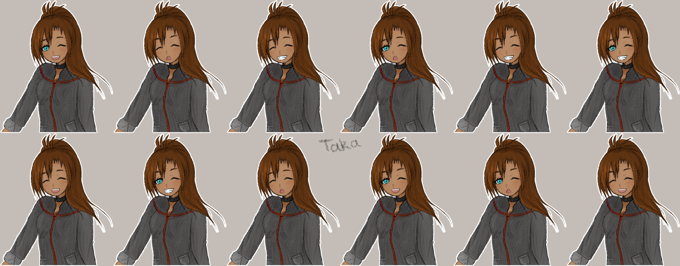
I’d show an example using your drawing, but I’d have to draw some lines over your art, and that’s a bit rude. x.x I’ll quickly do something in MS paint…
3 Likes
I love how lively your artwork looks. It suits Komari a lot.
As Takafumi said, though, you may want to practice more on the anatomy. There are a couple of ways to get a good grasp of anatomy in drawing. One is to use blocks:

(http://www.thedrawingwebsite.com/beginners-drawing/)
I personally don’t like how the breasts are drawn in the one I linked here, but I think it’s a good start. It’s much easier to imagine the body as a combination of the most basic shapes than going with the details straight away.
Another is to get a model. You can ask a friend or a sibling to pose for you. You can also, like, get a mirror and pose (I do this a lot, especially with hands haha). Observe the details and how they relate to each other. You can also look for poses online and base your artworks on them.~
Another thing to practice is lighting. This is a little harder and requires imagining the character as a 3D figure to find out which side the light hits and shadows form.
In any case, practice makes perfect. ;D
4 Likes
Thanks @Takafumi and @BlackHayate02 for the tips, i will keep them in mind, i have a doubt, the strokes of the drawing looks a little pixelated i am not sure about it, i guess is the resolution of my pc, i use Paint Tool Sai to draw.
1 Like
Damn, I’d forgotten to send my reply in. Sorry.
I agree with @Takafumi and @BlackHayate02 , but I think another point of improvement would be the skin colour. For having struggled with getting skin nuances right for five years (at least in this artstyle), I’d recommend trying for a bit more pink-ish hue since it can look a little bit sickly otherwise.
Not by much since you don’t want characters with fluorescent pink skin, but try to strike for a balance between what you currently have and such a colour nuance. A couple tentative drawings should be able to help with nailing it in a way you like.
Really nice eyes, BTW. It can actually be pretty difficult to get the hang of gradients and eye colouring.
1 Like
Thaks you Natsume for your tips, i’m glad you like it, i followed a tutorial to make the eyes, it was a bit difficult but i love the result of these.
@BlackHayate02 @Takafumi @Natsume
I would love to see some of your drawings.
1 Like
Alas, colouring is the only thing I’m any particularly good at (though evidence of this is scarce in my hard drive. I’ll have to pull it up sometime). I can’t lineart worth shit, so I don’t actually have many works to brag about. 
1 Like
Yeah, the eyes are really good.
Art-wise I’m pretty sucky. Hesitant to post my stuff since this isn’t really the topic for it, and there’s no other suitable topic… I’ll just use the ol’ expandables.
And then some none sketchy stuff:
5 Likes
Glad it helped!
As for my stuff, you can try finding it here in the forums (I have some few in this very thread), or over deviantArt. I’m still continually practicing, and trying to figure how to improve my work. It’s… not easy, but it’s fun. ^^;
3 Likes