The blog posts now pull comments from their linked threads and display them on the blog. Looks really nice! Also, it seems I’m now able to change the ownership of posts, so I went and attributed a few articles to @Takafumi.
The blog forum posts are formatted now, instead of just being a block of text~ Is that automatic or manual?
It’s not using the same plugin as before, so yeah it’s automatic. It doesn’t seem to format perfectly 100% of the time, but it’s a huge improvement.
Remember to report bugs! Discourse Meta would welcome any pointers to instances where it doesn’t work.
And Discourse upgraded to 0.9.9.10! Changes the look of a few things and fixes a couple of XSS vulnerabilities (those are bad!), tell me if it broke anything!
So, uh… there seems to be a bug in Discouse that basically breaks @Kanon’s avatar and nothing else. Looks like they got Sunohara’s luck along with that title…
We’re trying to fix it, but it’ll be a bit longer still!
(Also please don’t change avatar, that might fix it, but it’d be hard to figure out what happened and keep it from happening again ^^)
Removed the Key Project Promotion category as I decided it’s pretty unnecessary. All existing threads were moved to the Key Fanworks category instead.
We’re on Google+ and Youtube now!
https://plus.google.com/b/117920355357010970188/117920355357010970188
Since it was getting no topics, I’ve decided to remove the Translation Corner category for now. The Translation Request Board has been moved to the Key Fanworks category.
http://forum.kazamatsuri.org/t/welcome-to-kazamatsuri-org-an-introduction-and-some-general-guidelines/20
I’ve given the welcome thread a bit of an overhaul. I’d like to ask all members to re-familiarise themselves with the rules and guidelines. You can now also view them in the FAQ found in the dropdown menu at the top right of the forum. Also, let me know if I made any typos or errors 
And also, @Bizkitdoh has been promoted to moderator! He’s been an active and involved member of the community since it’s creation, so I only saw it fitting to employ him as our first moderator. He’ll be hopefully taking care of things while I’m absent (which is a few hours a day thanks to time zones.) Please show him your respect, and give him your support!
ITT: Aspirety and Uppfinnarn get off their butts and do some work on the site!
Changelist:
Front page: Fixed tags, changed capitalisation, added Charlotte tag.
Changed Menu (HOME is now NEWS, KEY GAMES is now SERIES INFO, links to CHARLOTTE page and tag added)
Stopped the menu bar from jumping when scrolling down.
Made it a little more compact.
Forum:
Figured out how to get polls working (not really a change, more a discovery).
Fixed line width, back to normal again.
Guild Category added, viewable only to members of Trust Level 2 or higher.
And that’s about it for now. Stay tuned for more updates in the hopefully not too distant future!
Thanks for the guild category. I guess you have figured out a good set of topics to put into it (mostly ones involving our own personal info, at least)

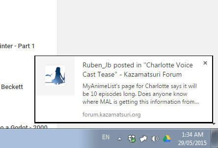
So apparently Kazamatsuri Forum Chrome Desktop Notifications are a thing now…
I should remember to enable desktop notifs on chrome, heh
FORUM UPDATE TIME!
Thanks to the help of @Karifean, I’ve managed to act out some updates to the forum theme that I’ve been meaning to do for a long time!
First off, BIG AVATARS! They’re so pretty! And they even have rounded edges, wow!!
And also! WE HAVE A NAVBAR! You can finally click to the frontpage and have it not look like shit! It’s still a work in progress, but I’m super happy to finally see it there! :kgoha:
Oh yeah! I added some custom emoji! I dunno if I’m gonna keep them on, but we can try them out for now. :komue:
I also added a badge for everyone who’s shared a photo of their Key 10th Memorial Box, and a user field people can fill out for their public profiles, displaying their favourite Key series! It’s completely optional, so don’t feel pressured to decide on one because of it, but I thought some of our members would appreciate it.
So yeah, big update! Let me know what you think! :masgrin:
sounds good and looks nice, but it’d be nice to know how we can use these emojis or are you still working further on them before fully implementing them?
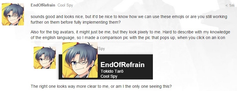
Also for the big avatars, it might just be me, but they look pixely to me. Hard to describe with my knowledge of the english language, so I made a comparison pic with the pic that pops up, when you click on an icon

The right one looks way more clear to me, or am I the only one seeing this?
it’s not just mine, it’s like that for everyones avatar, so they appear clear on your end?
edit: ok, clearing the cache worked. thanks
For emoji, use these words surrounded by colons:
kgoha
komue
masgrin
Don’t be alarmed by all the new and old topics getting bumped to the top, guys! Me and the team just had a massive working bee, going through and tidying up topics and adding rating polls to every route discussion topic! We also have lots of new topics new, filling in some of the gaps that were left behind in our discussion. Get rating discussing and rating! :masgrin:
EDIT: Oh and special thanks to Bonecuss for helping us out.


