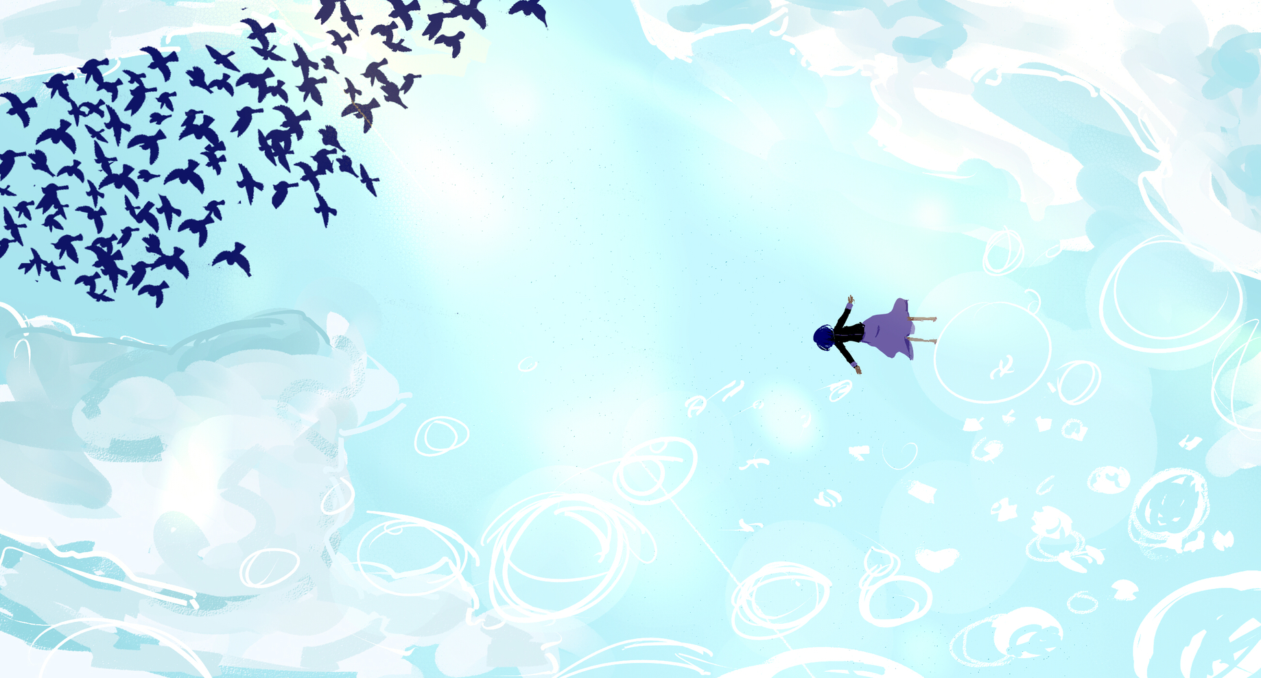
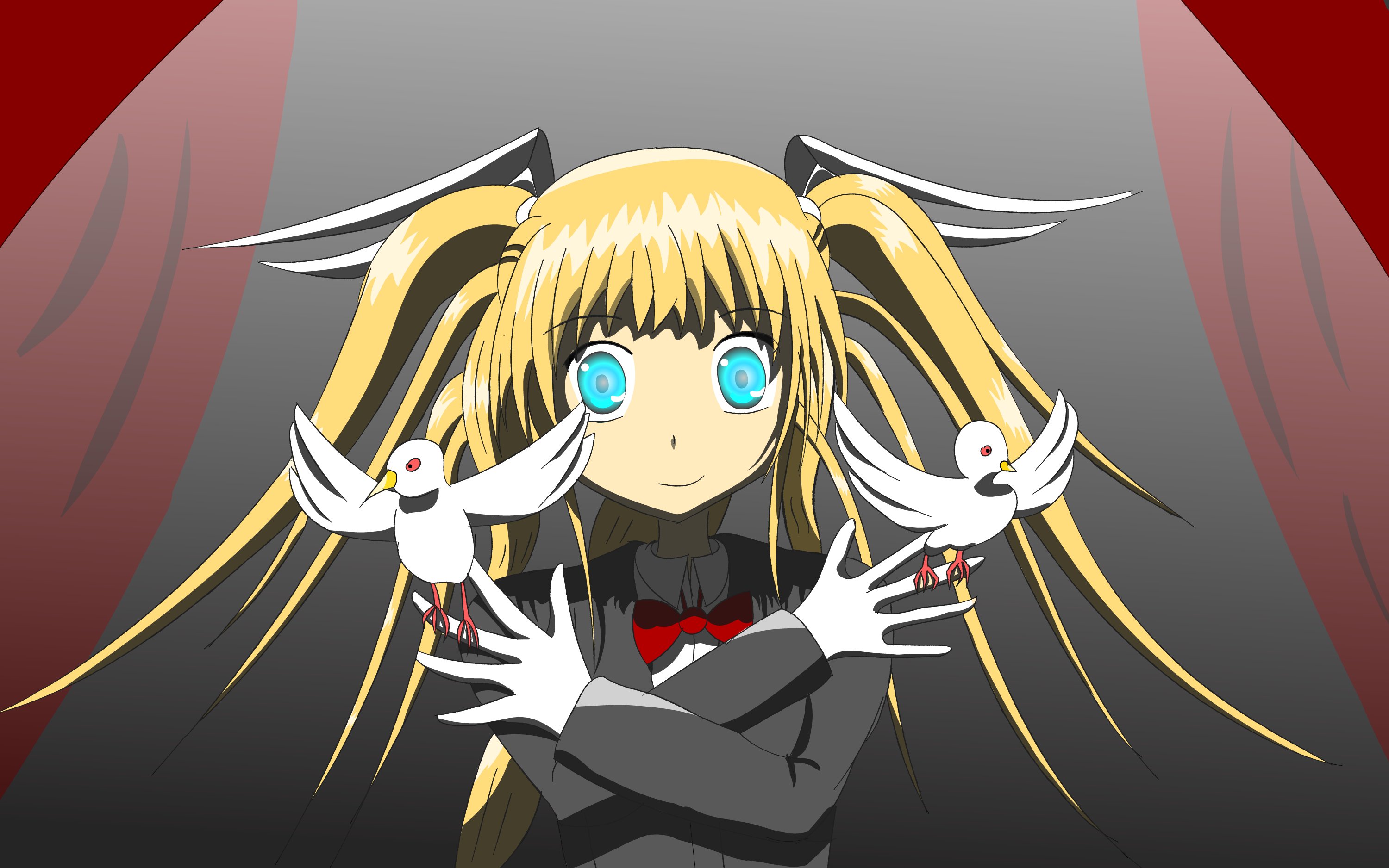
I actually love the second one as it is. The composition is amazing, if there’s anything I’d change is the white blurry parts in the middle. They somehow confuse me as I see them as light but Mio’s position and the birds don’t seem to match the light direction somehow.
It also works great with Mio’s themes. She is a solitary girl away from the rest (the birds), you can see both the sky and the sea (her dream and the place where she goes to erase her existance) and the light blue color that fills the background matches the whole feeling of calmness and emptiness that Mio gives off.
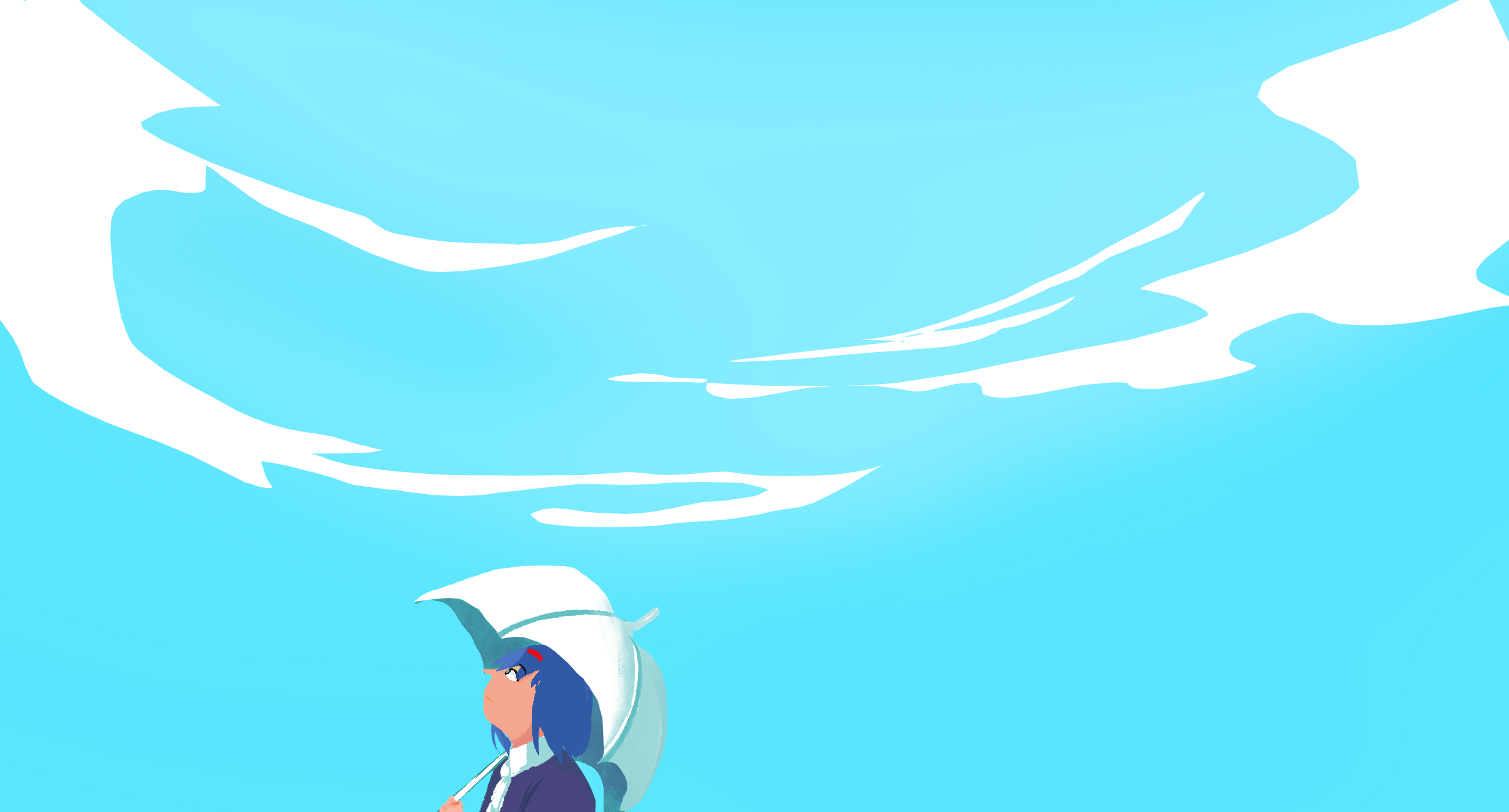
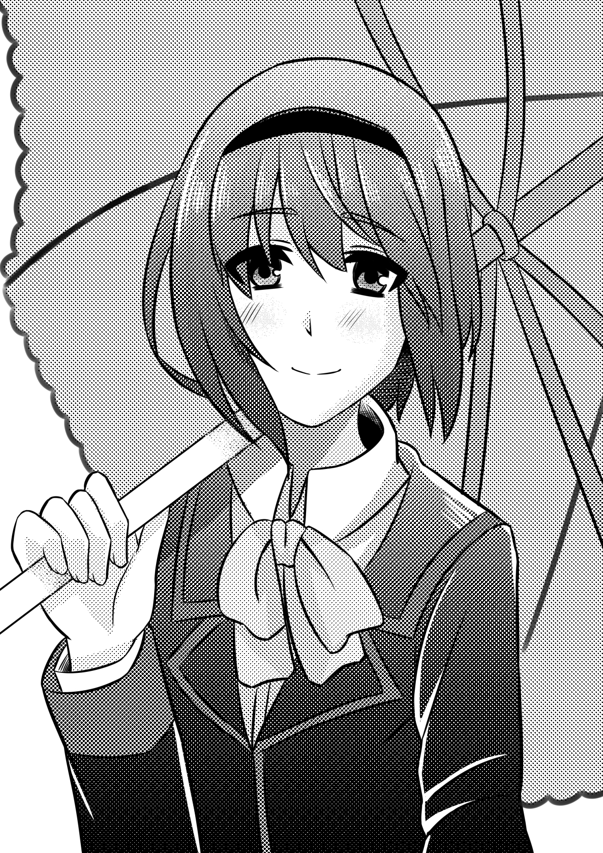
The first drawing feels too simple for my taste and I don’t know… I don’t quite like that style for faces.
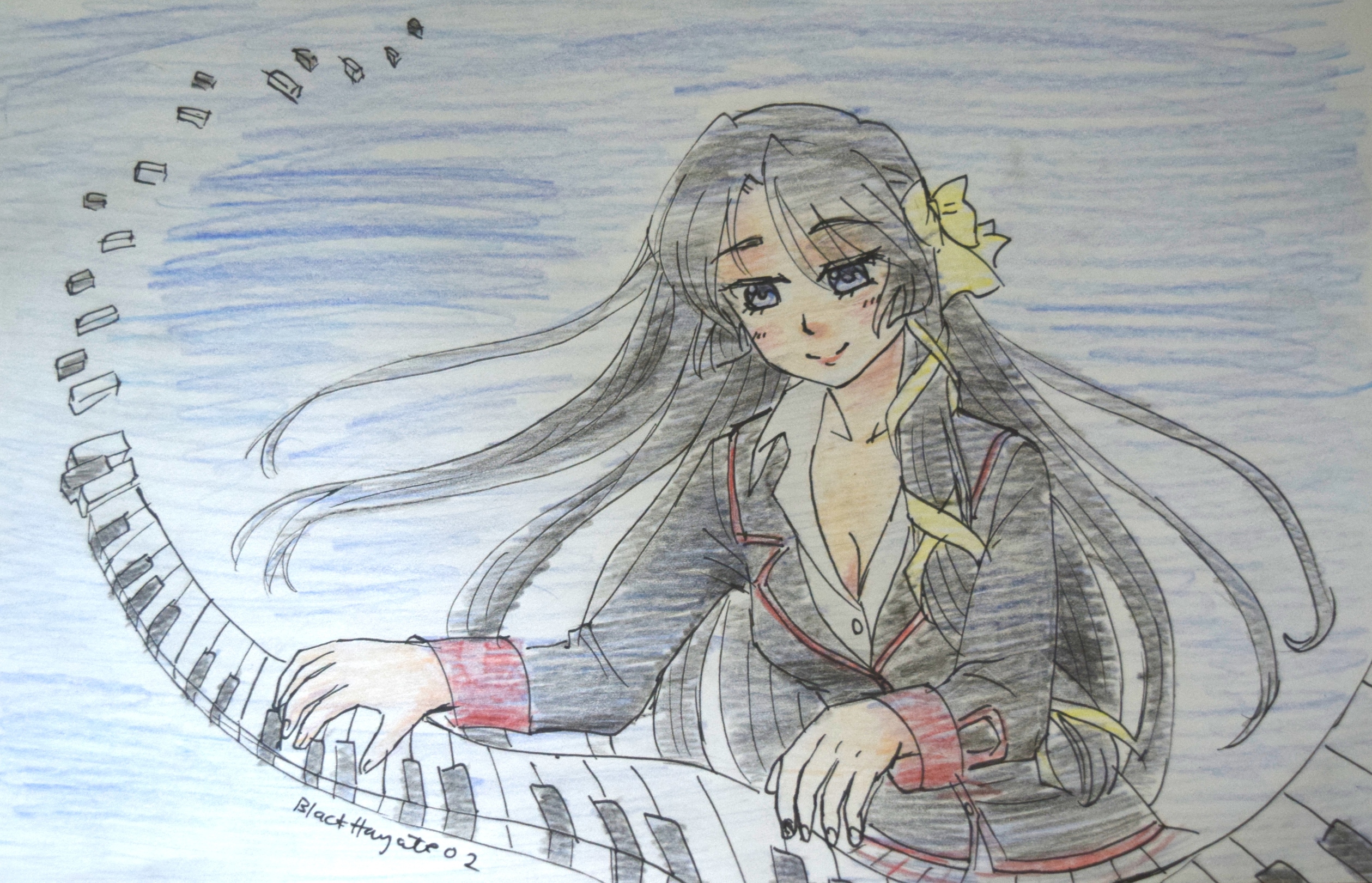


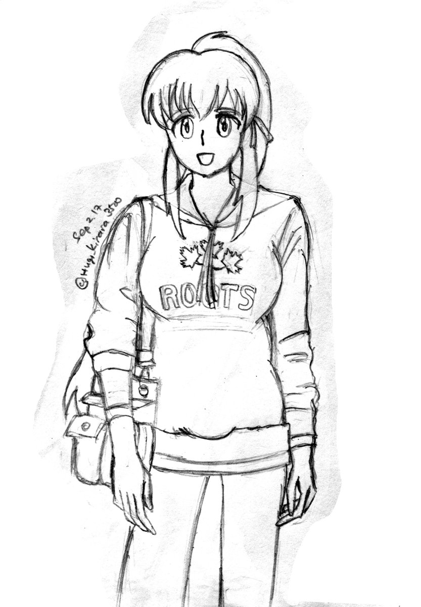
 `(´ω`u) I drew it in time for her birthday (excuse the incorrect date w)