It’s way worse in the final product!!!
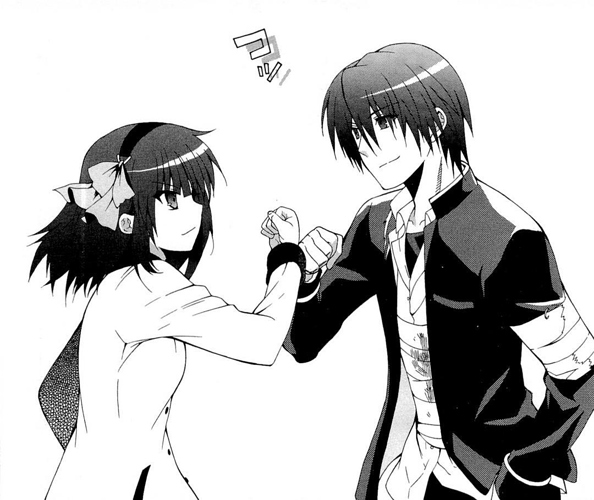
The final product was like, Yuri in full action to revenge the characters shown behind her… And Tenshi is totally the bad guy one.
But in any case I see Matsushita not getting any spotlight at all… I hate this sexist discrimination.
Oh wait, yeah, you’re right, that seems more accurate. My mistake ^_^;
What they should’ve done is place Otonashi and Yuri back to back.
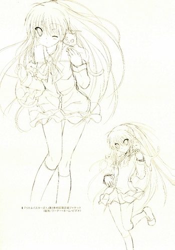
They used the designs of 6 and 4 in Litbus.
Design 1 and 4 didn’t show any interaction between characters, maybe a consideration for the selection.
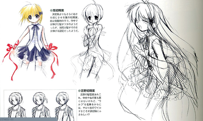
Who’s the girl with short hair on the first page ? There’s 4 different designs of her and the the biggest one of her has reddish-purple hair ? Was that Shizuru’s initial design ?
Isn’t that Kotori?
I couldn’t read the language  Though she does look Kawaii. I get why they didn’t put her in though. Imagine her being in the visual novel, she’d be out of place. But, that’s Kotori ? The one with short hair and the short Haruka side ponytail on the first page ?
Yep, that’s Kotori.
They have the same face, personality and body type. It certainly doesn’t match the sprites of the other characters.
Well I thought it was Shizuru’s concept for a bit, since I saw the blonde version of the girl and she looked like SHIZURU (excluding the eyes and eyepatch).
Shizuru is actually the tall one in the lower left of the second picture. Lucia and Shizuru pretty much switched designs it looks like. The comment on it even says ‘How shocking an oneesan Shizuru’, roughly translated.
I gotta say, she looks a lot better in the rough sketches than in the actual colored version XD
If there is anyone interested about the drawing progess of Hinoue Itaru, just watch this video (our channel recorded)
Oh. She looks like a modified version of asanas San ^-^
Personally my reaction upon the Anime BD Cover Rin: “Woah, she doesn’t look like Rin. She doesn’t look like drawn by Na-Ga, even.” And yes, I do prefer the sketches than the colored version.
Also, love how Hinoue wrote “No Chest” on Kagari’s chest lol.
There is always this thing I find interesting.
(Rewrite Spoilers incoming)
In Rewrite VFB, there is a Kagari, or at least an alpha design of her on page 198, features a girl with even flatter chest than our current Kagari, an X-shaped hair ribbon-thingy in place of the ±shaped hair clip, blonde hair color and wears mainly white instead of black. Her red ribbons are also not connected.
An “awakened” art (albeit only line-art) is also depicted on the right. Interesting it’s the ribbon that extend instead of the tree motif.
IMO I always think it’s totally okay to have a Black and a White Kagari in the story. Since she’s based on the Daisyworld Model and it also uses the 2 colors of Daisies in the simulation.
As for why they didn’t do that, the Chinese fandom actually has a wilder guess in that originally Kotori, instead of another Kagari will become the Key of the Earth. It’s pure hypothesis based on various material so I won’t expand on that for now,


