Key Character Design Discussion

This is actually the same conclusion I arrived at. Each girl’s hair accessory in Little Busters! is symbolic of something regarding their personality or story. Kurugaya’s was the hardest to figure out because it took some research. Though exactly where this symbol drew inspiration from is up in the air. It could be from the original poem that started the yellow ribbon as this symbol. There was also a song from 1917 inspired by the poem. There’s a film called She Wore a Yellow Ribbon from the 40s that has a song of the same name with slightly altered lyrics which the US army also uses. However, song you mentioned is the most popular of the four iirc, so it’s likely that that was the inspiration for Kurugaya’s ribbon. Regardless of the inspiration. I’m certain this is what the ribbon is symbolic of.

2 Likes

I’m kinda curious what you think of all the other girls’ accessories. I can definitely see some symbolism, but nothing that ties in too strongly with their character nor personality

Well, Rin’s cat chime matches her cat personality, not only because she grows cat ears from time to time, but also since she is shy and flees from people who she doesn’t know but is still very loyal to her very close friends.

As for Komari, well, she likes shooting stars and has that “a wish for me and a wish for you” meaning, but I can’t see any further symbolism.

Haruka and Kanata have those identical purple balls because they are twins

As for Kud, no idea. Maybe someone can enlighten us?

I don’t remember any other accessory. So, in general, I’d say that they indeed regard something in their personality and story, but the way they do is very different from character to character. As stated with Kurugaya, that symbolism is cryptic as hell, while Komari’s and Rin’s are pretty straight forward.

Her bat hairpin is like the easiest one. They directly relate Kud to Aesop’s fable about the bat, the birds and the beasts. Like the bat being in between a beast and a bird, Kud is in between a Japanese and a foreigner.

Also, Rin’s name, 鈴, means bell. They really weren’t subtle about that. I’ve already talked at length about Mio. Sasami is just made to look like a cat even more than Rin. According to Na-Ga, she is a Siamese cat specifically. I’m not sure what to say about Saya. Her design just has a bunch of shit going on with her ribbons in different colors and how some of her hair goes along her back and the rest along her shoulders.

2 Likes

The others more or less got everything.

Stars are about as important to Komari as they are to Yumemi and very much in a similar vein. Stars are a running motif throughout her character arc: the rooftop stargazing scene, Rin’s wish, the Little Match Girl story. It’s representative of her hopeful nature which you can tie into her personality, the theme of her route, and a theme of the overall story of Little Busters!.

The others got Rin’s ribbon. IIRC, we learn either in Rin2 or Refrain that Kyousuke gave her the ribbon, so it serves as a symbol of their relationship as siblings well. I feel like there was more to it, but I can’t remember, and I feel like that bit I’m forgetting answers why it’s a bell as well.

Haruka and Kanata’s symbolize their relationship as sisters both because they have matching accessories and because the accessories are made of two balls. This is similar to the symbolism of the egg in Haruka’s route. This is also similar to Kyou and Ryou’s ribbons in CLANNAD.

Like HeliosAlpha said, Kud’s bat is symbolic of her status as the foreigner as well as what that means to the team which is explained in the fable. You can also bring her hat and cape into the mix which represent her relationship with her mother with the colors likely being representative of Tebwa’s national colors.

Mio’s is the most plain of the hair accessories as it’s really the only normal one if you think about it, so that’s fitting. I wanna say it is red because red is the most visible color on the color spectrum and it serves as sort of an ironic contrast to her tendency to blend in with the background, but this would also fit Midori’s tendency to do the opposite. I came up with more to hers while I was reading her route, but I was so into it that I forgot to write it down and forgot. If @HeliosAlpha has more, I’d love to hear it. :slight_smile:

Sasami’s ribbons are meant to make her look like a cat. I can’t remember where, but I remember there being a specific scene of her in a cat pose with her silhouette made to look exactly like a cat on the wall behind her, and it was a really unsubtle clue into that. I can’t remember where it was though. I thought it was in either the OP or the ED of the anime, but I guess not. It might have been one of the box arts from the BDs or maybe it was in the anime, but not the OP or ED. This one kind of serves the same purpose. There are probably tons of ways you can interpret her relation to cats (aside from the obvious cat of her route) in terms of the nature of cats, what cats have meant or symbolized historically, superstitions and so on and so forth, but I feel like that’d make an interesting write up for another post on another day.

Saya’s is the only one I’m legitimately clueless about. I feel it’s something that would have to be found in the EX VN rather than the anime because after watching the EX anime twice, I couldn’t come up with anything (or maybe I just wasn’t paying enough attention), and I seriously doubt that this character as Maeda’s favorite of the bunch would lack meaning here when all of the others have some meaning to derive. Why does she have two different kinds of ribbons? Why is one black and two white? Is there a reason for her having three in total? Is there a reason they’re opposite colors or do the colors symbolize their own things? Are their placings (white on top, black on back) relevant? I have no idea, but they’re all questions I plan to keep in mind when I’m able to read her route in EX.

2 Likes

I would like touch up a little on Kurugaya’s ribbon design specifically for its color. In Japanese culture, yellow has represented courage, wealth, and urbanity since the War of Dynasties in 1357. During this era, warriors wore yellow (golden) chrysanthemums which is a pledge toward the emperor in Japan and royal family. The yellow chrysanthemum even is an emblem which is one of the the national seals used by the Emperor of Japan and members of the Imperial Family. This resembles Kurugaya’s outwardly image the characters views her as which is the reliable, strong, and “onee-san” figure that is to be looked up to. She even edifies courage upon the members especially when she interacts with Riki and teaches him that “No matter what happens, you have to look forwards” which of course is basically telling him to have the confidence and audacity in whatever he does.

The heroines within Little Busters! sure have hair pieces which well symbolize their character design and personality. However one character we’re forgetting, though is not necessarily a heroine, has an important hairpiece which is important to a certain side plot of Little Busters!

Red has the connotative meaning towards energy and primal life forces and most of red’s symbolism today arises from its powerful associations like the blood shed from fierce battles in the past. Masato’s red headband is the manifestation of his pent up strength and vigor he has built through rigorous muscle training everyday. Being tightly wrapped around his head which is held by a tough knot that is seemingly impossible to untie, the headband acts as the bond of strength that stands out as his key aspect (besides his muscles). Within Little Busters!, Masato and Riki pursue a dream for the muscle revolution. This is where the red Headband plays its important part since the Japanese flag has the same resemblance to Masato’s character design. The sun plays an key role in Japanese mythology and religion as the Emperor is said to be the direct descendant of the sun goddess Amaterasu. Wearing a white tee shirt that is always exposed with the headband combo, he literally becomes a walking Japanese flag, Masato holds the vision of a future of muscles which will revolutionize the world

5 Likes

I have a question. Someone brought it up in the Key self-reference topic. But Chihaya was quite obviously based off of Makoto. Both from Hinoue. And I think the reasoning is because (Meeting Makoto and Meeting Chihaya for the first time spoilers) they both hold a grudge/hate the MC. Makoto holds a grudge against Yuichi for an “unknown” reason. While Chihaya holds a grudge/hates Kotarou for “cherries”

So my question is. For Key, is it likely that the character designers draw freely for the characters, are given a sypnosis of the character, or read the scripts first ? I know for Na-Ga, it was different because it was anime-originals (plus in AB, over 75% of the characters had no backstory).


Reviving this thread just to nitpick on Rewrite anime’s occasional way of drawing Kagari’s dress… in side view. I don’t know why this is happening, but sometimes, the dress looks so awkward and just loses its sense of being “flowy.”

And what makes it particularly frustrating is that the dress doesn’t seem to move along (like a normal garment) while she’s walking, which makes it even more awkward ahaha. It’s like the entire skirt is made out of pure petticoat or something.

3 Likes

Yeah this has been bothering me too :stuck_out_tongue: Kagari wasn’t meant for anime!

1 Like

Random: if there’s another thing I like about Rewrite anime, is that Jasmine’s character design looked literally like a jasmine plant. :stuck_out_tongue:

2 Likes

How? I’ve never seen the plant irl, but according to google it just looks like a bush with white flowers. Besides that, she just looks like a Kinmosa version of the original.

3 Likes

That’s just really what I meant by it. :yahaha:

1 Like

I wanted to go over the 4 designs from Harmonia and what conclusions can be drawn from that.

Starting off with Madd because I don’t have much to say about him. In the story, he’s a grumpy shopkeeper dealing in everything from groceries to repaired machinery. As for his looks, he’s a bulky man with darker skin and wild facial hair. His clothes and color scheme are nothing special; he has that durable looking apron that’s fit for working with metal and stuff. His design doesn’t really scream anger to me other than maybe the eyebrows. He could easily have been a nice muscly guy like Masato.

Similarly, Rei also has very few distinguishing features; mostly, he looks like an average guy with an expressionless color scheme. His glove would have been interesting point if we didn’t know why he wears it. The thing I think is the most interesting is his shirt. The turquoise color and the weird V-cut gives it a extraordinary, sort of futuristic feel. His metallic hair also has a similar effect.

And as soon as we get to the girls, the design are ten times more expressive and detailed. If I was to summarize how Tipi looks, I would say that she looks like a doll. Her excessive amount of frills and hair along with her small stature really gives me that feeling. She has a yellow dress, kinda violet hair and intensely cyan eyes. Her eyes are further emphasized by her other colors being quite pale; it’s possible so much focus was placed on her eyes because of how she cries almost constantly. Another detail that I find interesting is how the ribbon on her head falls down to make a neat frame around her face.

I have to start by saying that Shiona is fucking gorgeous. Her outfit is a spiced up version of a nun’s robe fitting since she lives in a church, though Hinoue obviously took some creative liberties in order to make it interesting to look at. Her dress is a combination of white and a dark blue with some golden touches. This looks good on it’s own but is clearly overshadowed by her long golden hair and vibrant blue eyes. There is also the tiny bit of mint green added through her hairband; perhaps Hinoue thought a less impactful color was needed to balance the design. Shiona has an immediately striking design with lots of energy and color which is perfect for the symbol of happiness that she is to everyone around her.

I found an interesting relationship between the design of the girls and their roles throughout the story. Their color schemes are mirrored to a degree. Shiona has blue clothes and blond hair while Tipi has a yellow dress and blueish hair; Tipi’s colors are also mainly paler while Shiona’s are very saturated. Partway through the story, the two are seemingly made out to rival each other for Rei affection. However in the end, they each give Rei a tool necessary for his mission: Tipi provides knowledge, and Shion provides emotions. At that point in time, they are no longer rivals but instead two parts of a whole.

13 Likes

I’m sure much of us would agree that she’s pretty inconsistent in anatomy, but I think much of what I really like about Itaru Hinoue’s character designs is how well thought-out the designs are. By that, I mean that the character designs she makes within a game creates synergy to each other and the general visuals of the game.

Just look at Kanon. The colors of the cast, for the most part, are carefully chosen to match the overall atmosphere. There are a lot of blues (Nayuki, Akiko, Makoto’s outfit, male uniform) and oranges (Ayu, Makoto’s hair) in the designs to match the wintry sky made prominent by the snow-white town. There are also browns (Yuuichi, Shiori, Kaori) to match the trees. Mai’s design is especially meant to match the evening scenery she’s often seen at.

The vibrantly red female uniforms is probably there so that the character designs don’t drown out too much with the blues and oranges, I guess. (BTW, I just noticed that all the heroines have some red in their designs, which is interesting.)

As for my favorite, I personally like the overall character designs of Air and Rewrite best.

For AIR, the girls’ designs are united by blue color, (Kano’s hair, Misuzu’s eyes, Minagi’s hair decorations) which is the color of the sea and the sky. Apart from that, there’s a lot of warm colors and blacks that creates a sense of nostalgia and ‘olden times’ (can’t articulate it well), which is basically AIR’s general ambiance in the first place.

I also really like Kano’s character design, especially her casual outfit.

For Rewrite, there are a lot of nature colors in the designs. Besides the eyes, nothing much else is too vibrant – any color beyond shades of browns, oranges and yellows are toned down. Red shades are either pink (Kotori’s casual outfit, THE UNIFORMS) or maroon (Shizuru’s jumper, Kotori’s skirt). Purple shades are lavender (Chihaya’s dress), or dark purple (Chihaya’s skirt, Lucia’s hair). The vibrant red color is saved for the uniform trim and Kagari’s ribbons. There are also a lot of blacks, too, from Kagari to Akane to Lucia to Kotarou as well.

I also noticed that the simplicity of the designs (sure, the uniforms are detailed, but they stick to few colors) is to make it easier to blend with the environment.

6 Likes

So, this is going to sound like an awfully strange way to begin a post in this thread, but after looking at Kappei’s character design, I just can’t see what about it gives me much insight into his character.

Aside from the obvious detail of the bag slung over his shoulder, which tells you he’s a traveler and hints (Kappei Route spoilers) at his homelessness , he has a wide-eyed, innocent look to him. Although he’s clearly meant to be a trap character, I thought he looked less feminine and more baby-faced. The wide-eyed, innocent expression he has in the shot below gives me the impression of a character who harbors several child-like philosophies, including a simple view of the world. And while elements of this initial impression of mine are seen in his poetic assessments of the most mundane of situations, his awkward attempts to reach out to those around him, and his hilariously simple outlook on what’s likely his first crush fit into this, his well-kept appearance doesn’t. (Kappei route spoilers) As someone who has failed to keep a job for long and who has been traveling for a long time, he likely hasn’t washed or dried his clothes in quite a long time. What little money he has he seems to just use for essentials, but there isn’t anything about his outfit that hints at poverty. His coat has a muted color, but it doesn’t look dirty or wrinkled. His jeans (from what we can see of them in fuller images) seem adequately clean and wrinkle-free (all I could find on them is that their likely form-fitting, a style which I believe is supposed to emphasize his feminine looks, as I don’t believe they were common for males at that time). At worst, I think he might wear sandals, but even then, I feel that’s a rather vague hint. I can’t really come up with a satisfying way his appearance ties into his character. I suppose the color of his hair and eyes is also relatively muted? Maybe that could imply (Kappei spoilers again) humble origins ? I’m curious to see what all of your thoughts might be.

The other possibility I can find is maybe (Big Kappei route spoilers) there is something misleading about his design. Although it portrays a kind, simple, child-like personality, it masks a devastatingly cynical attitude he has about his life’s prospects. Everything he did in his mind was a welcome distraction from the cruel realities he knew life would bring him back to. So, his quest to find a place to settle down was something he almost saw as escapism. But once he grew attached to Hikarizaka, he started to legitimately enjoy his time there, making friends with Tomoya and Sunohara and falling in love with Ryou. Any reminders of his secret he took great effort to hide, worried that he’d lose what he had if people knew. Once faced with the end, he initially determines he would rather die than A. lose the one memento he has to a life path forever closed to him, and B. be a burden to those he cares about so much. These are, in my mind, somewhat cynical, pessimistic views on his life that I think are supposed to clash with his otherwise identical appearance and friendly demeanor when you meet him at the hospital.

But I feel that’s a bit of a stretch, too! I just wish I could figure out the subtle meanings behind his design…

2 Likes

The sad truth we have to keep in mind is that character designs are done before the full stories are written. For example with Rewrite, the characters didn’t even have names at the time they were drawn. This also means that less important characters have a high chance of getting shallow designs. It’s pretty likely that Hinoue was simply told to design an androgynous traveler. The analyses that I do are very reader-centric, and there’s no guarantee that any of it was intended.

If we look again at what we have, here’s a full body art. Kappei wears a pretty skintight darker suit. This makes him look really thin, but it also looks like sports wear that’s easy to move in. In addition to that, he obviously has his bag and some sturdy boots. Key has a history of making their worlds very lenient on travelers specifically, so with that I’d say he fits the formula even without dirty or torn clothes. Other than that, I’d agree that his design is meant to be deceptive. The design gives an effeminate, childish impression while he’s actually a pretty wise guy.

5 Likes

Yes I had a similar thought. I only have played a small tiny portion of Kanon, but they are quite similar in ways such as looks and attitude. Cherries :smug:

I feel in general Key has a tendency to reuse their stories/ character types in their games such as Saito in Clannad, and Little busters. (I know, a recurring gag, but still) The Fujibayashi twins and Futaki and Haruka. And some really funny scenes with your best buddy in game like Sunohara and Yoshino.

But then again I can’t deny that its an effective way to relate and understand the characters more.
Its all too easy to enjoy something classic than exploring new territory.

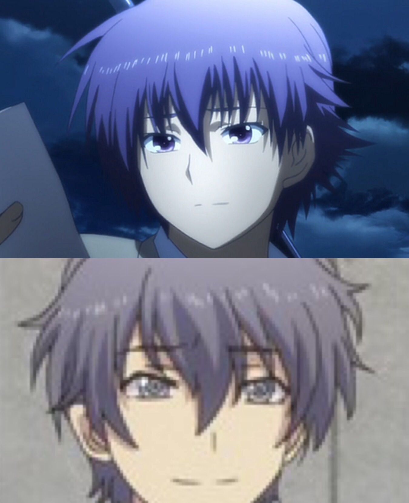
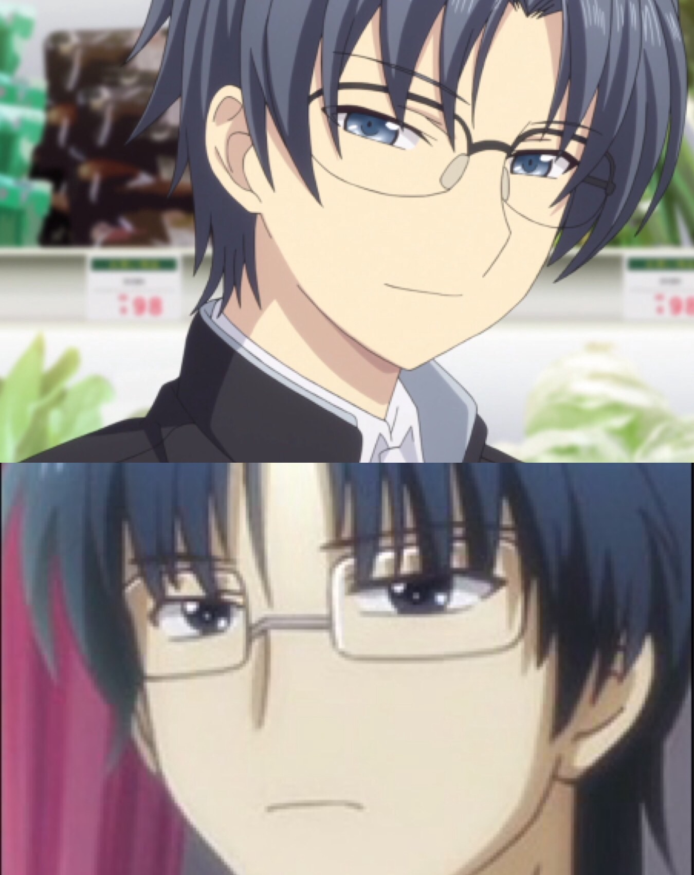
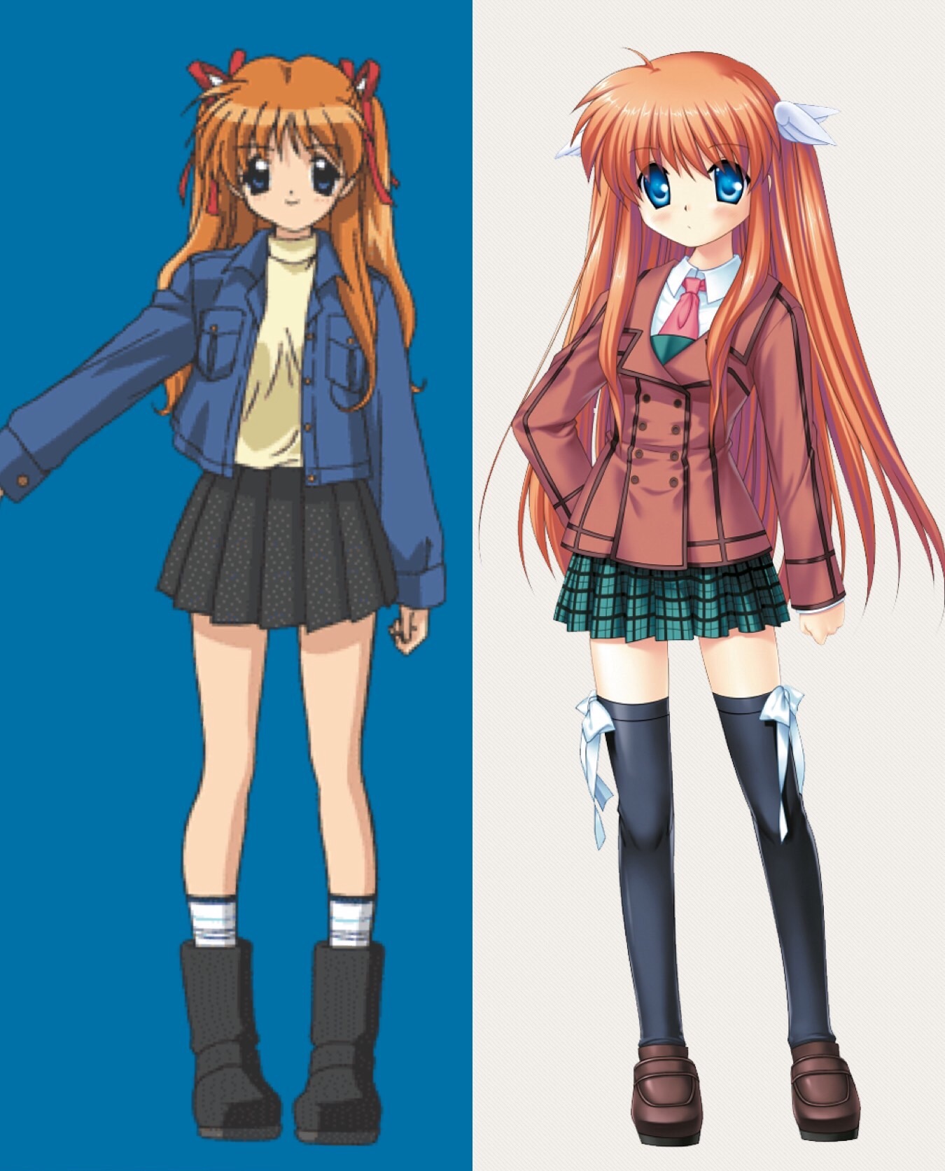
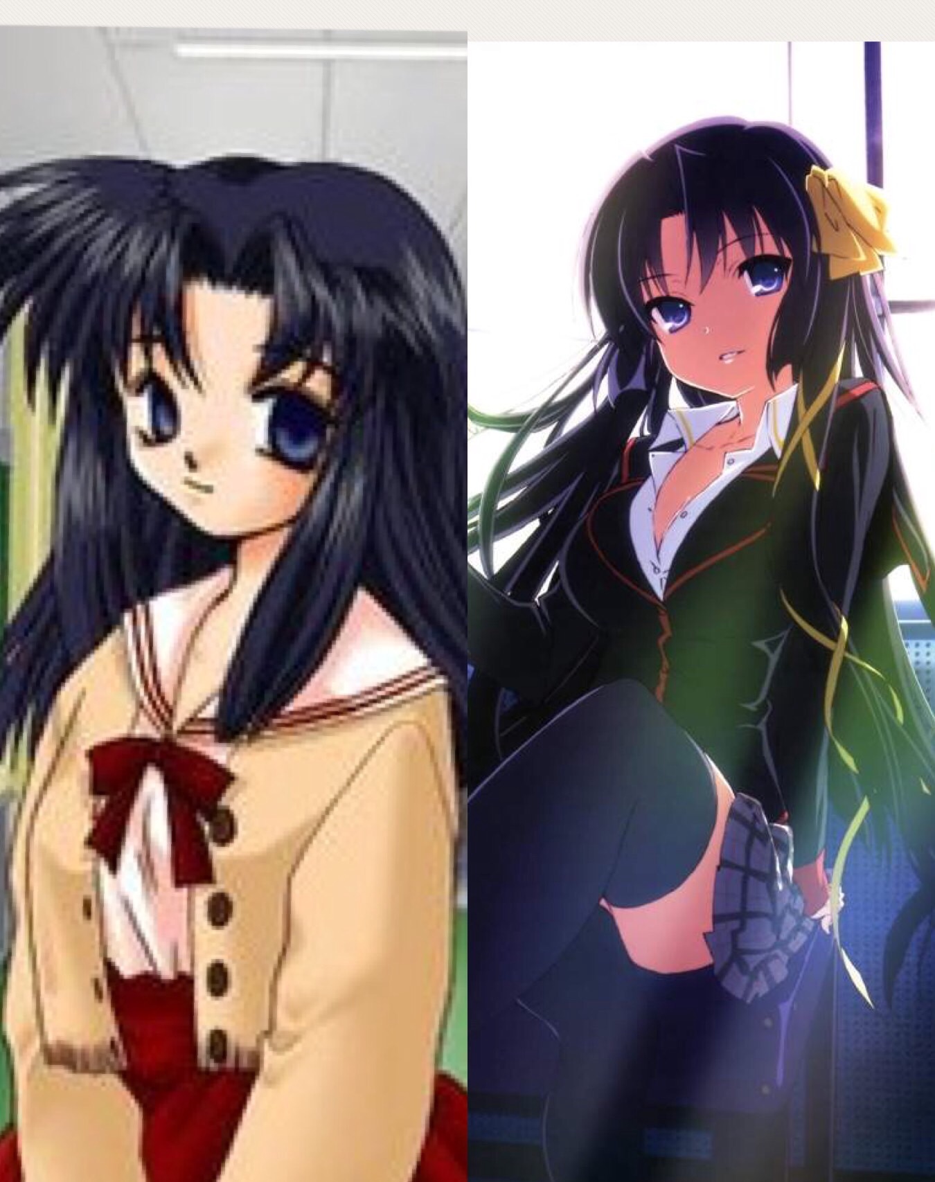
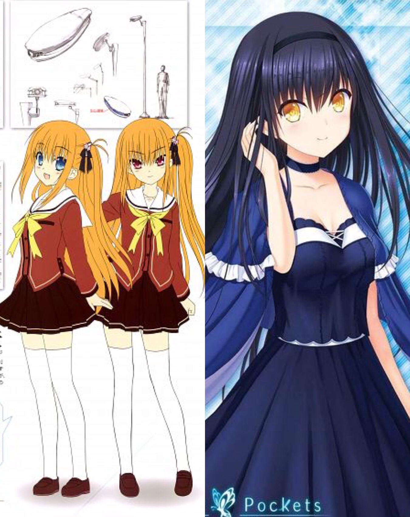
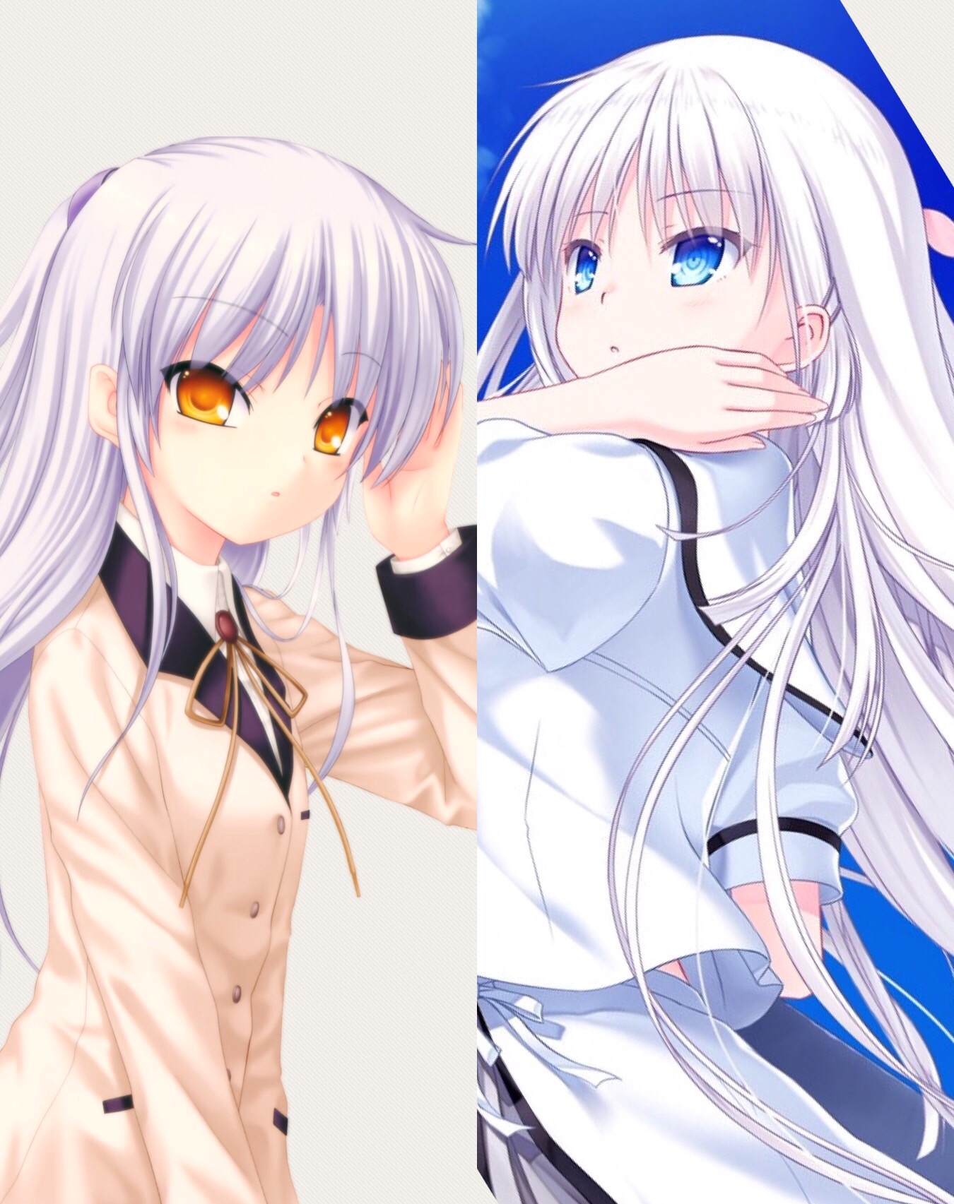
Itaru Hinoue and Na-Ga usually reuse older designs for their newer works for a reason. I appreciate that they’re always finding inspiration from their own designs to use for their newer designs however!

Itaru Hinoue has been designing characters for over 20 years, and Na-Ga has been designing characters for over 10 years. It’s completely natural that their newer designs would feel similar to their older designs because they’re always following a specific head shape and art style, so they are always limited on what they can do for the designs, and also because since they’ve designed many characters for a long time, it’s natural to not have as many original designs as they used to. They consider the medium that they’re given and make designs based on that. They have to also consider how the design compares to past Key designs.

Designs are for sure limitless! But because both Itaru Hinoue and Na-Ga have created a sort of prerequisite for what a design should have, they feel an obligation to stick to what they know best, and due to that, they are limited for what they can do. Many things go into the designs, and it’s just their styles.

It’s why their designs usually have bangs, or why the girls have the same body types, or why the girls never have crazy messy hair, or even why they have the same big eyes. It would mess with the established ideal designs for the medium they’re doing designs for.

I think it’s actually very amazing that Na-Ga and Itaru Hinoue are still doing more and more designs, as I am always glad to see more designs come out from them! Whether the designs are new or reused, I always find it amazing to see both Itaru Hinoue and Na-Ga’s art growth as time passes! They’re amazing artists and have shaped up many wonderful designs for Key!

2 Likes

I personally don’t have much issues with Na-Ga’s art, as I can personally see his improvement from his designs. Even if he did reuse some of the older designs of the characters, I can tell them apart by just simply looking at them. It’s like the characters have different identities.

I’ll use the characters from your example.

I also included Saya because I think Yusa/Misa was based from Saya’s design(?), and Kamome was based from Yusa/Misa(?). Even they are based from past character designs, they still look different. Even if you change Kamome’s hair color and eyes similar to the two, I could still tell who is who.

Well, I can’t say for the male characters you’ve given. They really do resemble a lot with minor differences, but I’m not going to nitpick it that much because I want to focus more on the heroines.

However, I do have issues with Itaru Hinoue. There’s a limit of how you will reuse the older designs of your characters. This is more evident to her present artstyle.

There’s a huge difference with how Na-Ga and Hinoue design their characters based from their older designs.

For example, with Na-Ga…
2
Even they almost have the exact same hair color and such, I can still distinguish them apart. I can tell who is Kanade and who is Shiroha. Even if you change Kanade’s eye color same with Shiroha, I can still tell the differences even if it’s subtle. The huge contributing factor of it is that, his style improves from AB! to Summer Pockets.

But with Hinoue…
4
Especially with her recent artstyle… Change Shiona’s hair color similar to that girl from Haruka Drive, and they will look exactly the same. The expression, the roundness of their face, especially the eyes, it’s so similar that it feels so lazy. Worst is that all of the Haruka Drive girls look the same, with just different hair, etc. This is an obvious same face syndrome.

She could at least not stick to ‘Harmonia artsyle’ too much and just change the coloring style of it.

I can really tell that she’s trying different things and approaches to her artstyle. I personally think she did improve throughout the years, and I do like some of her designs from the past.

It’s just…I am not really entirely sure what is going on with her artstyle recently. Well, I guess I could commend her for trying something different…

I get that they do reference and get ideas from their previous character designs. But, there is a difference between referencing and getting inspiration from it, to just doing almost exactly the same thing and change the color of their eyes and hair and put different hairstyles and that’s that.

I’m just basically complaining to her recent artstyle. I do have some issues with her previous artstyle, but I have more issues with her recent artstyle.

Now for some quick planetarian mech design. So with real life fiddler crabs a defining feature is how males have one claw that’s significantly larger than the other. This is reflected in the railgun mounted on the right side of the machine with a much smaller apparatus on the left.

Comparing the rough and the CG, you can also see the differences in the cannon’s folded up and deployed modes. Suzumoto tweeted out that this was in the original design. It wasn’t something made up for the anime. If you look at the deployment sequence in the anime, it pretty much opens up like a crab claw too.

It’s fascinating how intricate the planetarian designs are under the hood. I recall a time when Suzumoto like tweeted about Yumemi’s weight (several hundred kilo) and how most of the tech went into her upper body so she could express herself. Her lower body is then pretty shit because she was never intended to do anything but walk around in a confined area. And like none of this stuff is told in the text or had any significance until 12 years later.

6 Likes