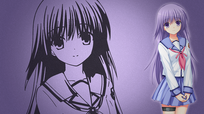
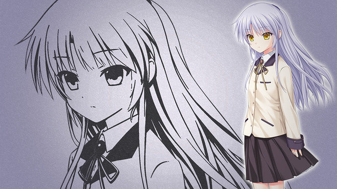
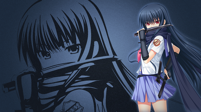
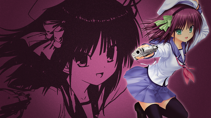
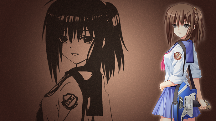
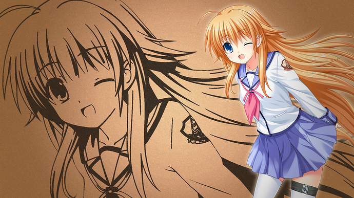
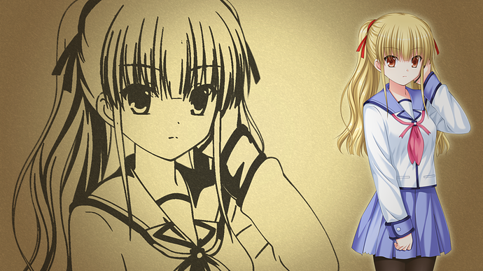
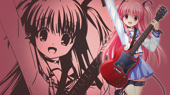
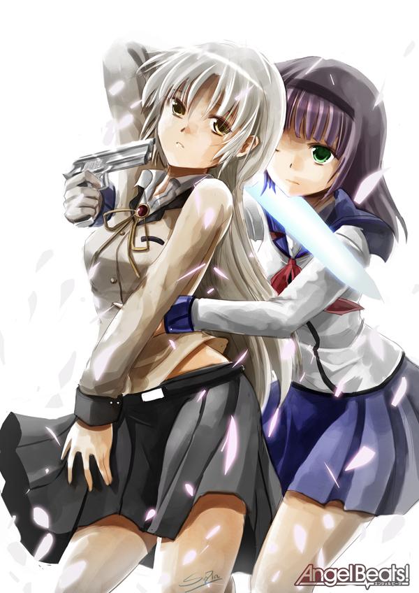
I was listening to Ichiban no Takaramono and got a strong urge to draw these 2.http://imgur.com/WHYbTBt
Kawaii fanart. I really like it @ChikyuuIncho
Thank you!
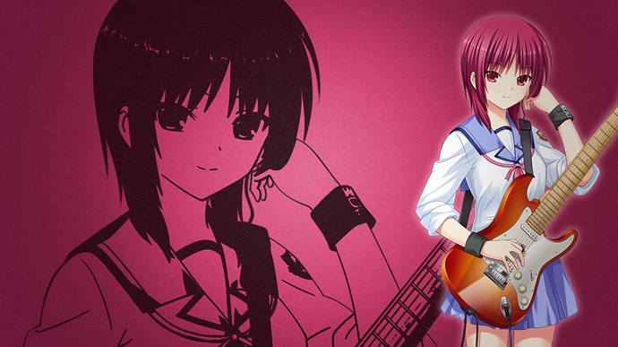
https://orig00.deviantart.net/8cc6/f/2015/144/7/e/yui_angel_beats_by_kingdomheartsgirl57-d8ul2ac.jpg I drew this a few years ago using Pokemon Art Academy 3DS game. 
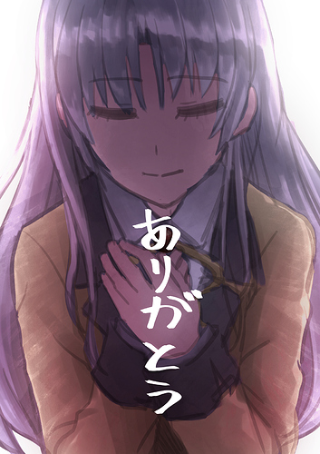
Doing this while at workplace today
Man I love these. Minimalistic, but really pretty. Keep up the good work!
Lately, I had been losing my motivation to draw.
It feels like I forgot why I want to draw…
To change my mood, I decide to rewatch angel beats again, the first anime I ever watch
And now I think I finally remember what I want to draw.
While it seem kinda impossible, just like Iwasawa get saved by “sad machine”, I want my work save someone too.
Rewatching angel beat was really a right decision.
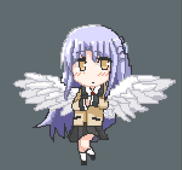
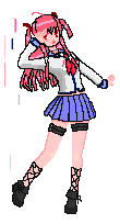
Not bad! But I find it a bit odd how her outline changes colour at the top of her head.
To bounce off Aspi’s comment, here’s something about lighting, possibly the most annoying part about pixel art.
Identifying the light source of a piece is super important. In this Tenshi image, the light isn’t super well defined, but the hair highlights are a great indicator of where it should go. Top left, slightly above Tenshi, and in a 3D space slightly behind the camera.
If you look at the left side of the image, at the hair beside Tenshi’s eye, you’ll see it’s colored a darkish purple. The hair to the left of that is however a light grey, even though they’re very close to each other. The change there needs to be less sudden. Personally I’d bring the light up slightly, so that the arc of the far left hair can be used as a gradient. It looks nicer to change light on an arc than on an angle.
In a similar vein, the very dark grey on the right side is far too much for that part of the head. That curve from the top of the skull should be connected to the same layer as the dark purple line below it, but instead the color of the line connects it to the hair at the back.
Somewhere that this dark shade does work however (that you’ve correctly drawn) is on the hair to the right side of the image, next to Tenshi’s cheek. That part of the hair will be facing inward towards the face, and so the light source would be blocked. That addition of dark shading brings the hair to a forward plane, above the hair to the right of it.
Also when making a curve in pixel art, right angles are a no-no. To make sure your lines look smooth instead of jagged, cut off the diagonals of any corners, as shown in this super ms-painted example.:
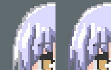
That aside, it looks great. The face and the wings are amazing, and the actual coloring and shading of the hair and the clothing is grand. Pretty amazing for a play around.
woah thank you for your input! I am learning much!
Yeah, It really looks better!
I will keep that in mind for the next pixel art hahaha
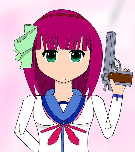
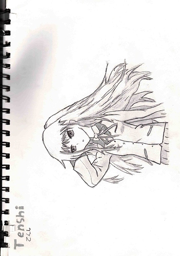
A mostly trace I did about 4 years, ago wasnt that proud of it then until I inked it about 4 months later when it actually looked like Kanade. Although I dont need to trace humans anymore, I still need a reference for it look remotely good.
Yes I am aware her name isnt Tenshi, I put that in the top left corner because thats what they called her in Japanese, it means ‘Angel’ I believe.
Waw this is great @stupid !